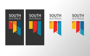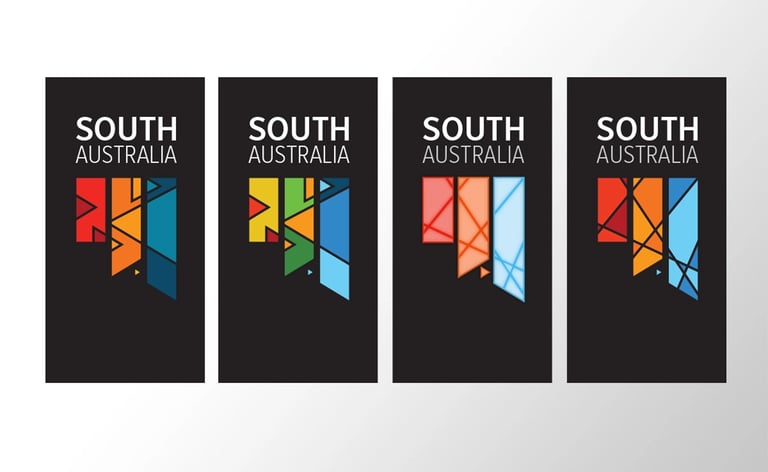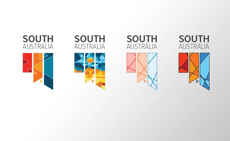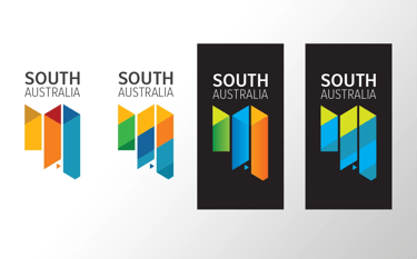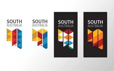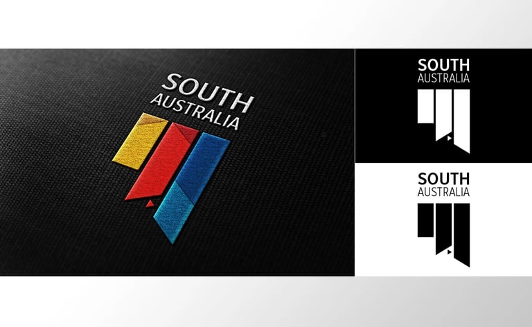
SA logo alternative
When the South Australian government unveiled the state’s new logo earlier this month it didn’t garner a lot of positive feedback. Adelaide Now quoted tweets that described the logo as “A folded milk carton. A Monopoly hotel. Hideously disappointing. Conservative and boring.” At 99designs, we couldn’t help but wonder what our design community might come up with as alternatives. Keeping with the theme of requiring a simple design that would work well across a range of different platforms, our brief asked for eye-catching designs that showed off South Australia in interesting and creative ways.
With the above in mind the following images are the concepts I came up with
the concepts

